
UI Guideline
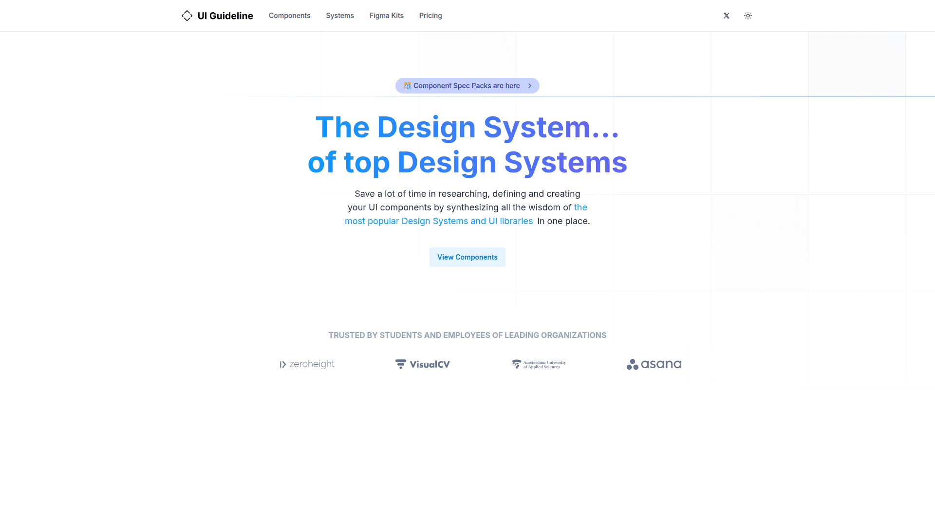
A comprehensive UI component reference that synthesizes naming conventions, anatomy, properties, and best practices from the top 20 design systems and UI libraries.
At a Glance
About UI Guideline
UI Guideline is a research-backed UI component handbook that consolidates insights from the 20 most popular design systems and UI libraries into a single reference. It helps designers and developers save hours of research by providing standardized component naming, anatomy, properties, and best practices. The platform offers both a free browsable component library and paid Spec Packs — downloadable files in PDF, Markdown, YAML, and JSON formats — designed to feed AI tools, design pipelines, and automation workflows. Trusted by employees at organizations like Asana, Atlassian, and Zendesk, UI Guideline covers 60+ unique components analyzed over 5+ years of research.
- Component Library — Browse 60+ UI components (Calendar, Modal, Button, Sidebar, etc.) with standardized naming, anatomy, and props derived from 20 top design systems.
- Component Spec Packs — Download per-component or full-library spec bundles including PDF specs, AI context files (.md), YAML, and JSON data files for use in Cursor, Claude, Figma plugins, or custom tooling.
- AI Context Files — Add
.mdspec files to your.cursor/rules/orCLAUDE.mdso AI assistants generate production-ready components that follow real industry standards. - Figma Kits — Access Figma-ready kits aligned with the researched component specifications.
- Design System Audit — Submit your component library for a full diagnostic scored against 20 industry systems, including a Slop Score™, naming alignment report, gap analysis, and a 3-phase fix-it plan.
- Systems Reference — Explore the 20 annually selected design systems and UI libraries that form the research foundation.
- Slop Score™ (Coming Soon) — Upload your component library to instantly receive a 0–100 quality rating measuring naming, completeness, consistency, and variants.
- Newsletter & Updates — Subscribe via Substack to receive new component specs, quarterly data updates, and platform announcements.
Community Discussions
Be the first to start a conversation about UI Guideline
Share your experience with UI Guideline, ask questions, or help others learn from your insights.
Pricing
Free Component Library
Browse 60+ UI components with standardized naming, anatomy, and properties for free on the website.
- Browse 60+ UI components
- Component naming conventions
- Anatomy and properties reference
- 20 design systems analyzed
Single Spec
One component, fully specified. Naming, anatomy, properties, and an AI context file based on 20 real design systems.
- Component spec PDF
- AI context file (.md)
- YAML + JSON data files
- Figma Build Checklist
- Accessibility & ARIA spec
- Keyboard interactions
Full Library
Every component in one download. Define your entire design system with specs backed by real industry data.
- All 40 component specs
- 40 AI context files
- Consolidated AI context (all-in-one .md)
- Complete YAML + JSON dataset
Library + Updates
Full Library plus every update for 12 months. New components, revised data, and improved specs delivered quarterly.
- All 40 component specs
- 40 AI context files
- Consolidated AI context (all-in-one .md)
- Complete YAML + JSON dataset
- 12 months of spec updates
- New components as added
- Quarterly delivery via email
- MCP Server (coming soon)
- Figma Plugin (coming soon)
Design System Audit
Full diagnostic of your design system compared against 20 industry-standard systems. Delivered in 7 business days, async.
- Slop Score™ — 0 to 100 quality rating
- Naming Alignment — yours vs. 20 systems
- Gap Analysis — missing components ranked
- Consistency Review — patterns & duplicates
- 3-Phase Fix-it Plan
- 20-min personalized video walkthrough
- All 46 Spec Packs included
- 12 months of quarterly updates
Capabilities
Key Features
- 60+ UI components analyzed from 20 design systems
- Component Spec Packs (PDF, Markdown, YAML, JSON)
- AI context files for Cursor and Claude
- Figma Build Checklist
- Accessibility and ARIA specifications
- Keyboard interaction documentation
- Design System Audit with Slop Score™
- Naming alignment and gap analysis
- Annual Top 20 Design Systems selection
- Figma Kits
- Substack newsletter with quarterly updates
- MCP Server (coming soon)
- Figma Plugin (coming soon)